Art that opens up new spaces. A country defined by contrasts. And finishing techniques that turn paper into far more than a printed surface. Our 2026 holiday card and 2027 wall calendar tell two very different stories - yet both reveal what can happen when design, technology, and craftsmanship come together with precision.
Some things reveal themselves at first glance. Others invite discovery: by taking a closer look, moving the material, running your fingers across a surface, or watching how its appearance changes as the light shifts.
That is exactly what our greetings for this year-end season invite you to do.
For our 2026 holiday card, the journey takes us into the world of sculpture and to a work of art that plays with space, material, and perspective. Our 2027 wall calendar, by contrast, takes us on a journey through Chile - from snow-covered peaks and cultural heritage to a modern metropolis.
Two projects, two stories, and one shared idea. Transforming a flat surface into an experience.

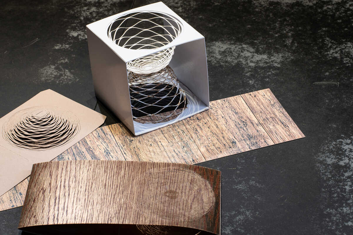
The inspiration for this year’s card comes from Fürth, Germany. At its heart is the work of sculptor Joseph Stephan Wurmer. For 17 years, he has exhibited at international art fairs. His work has been associated with venues and institutions including art karlsruhe, the German Bundestag Art Collection, and the Bavarian State Painting Collections.
Wurmer works in abstraction with a clear geometric language. Starting with naturally grown tree trunks, he creates sculptures that reveal hidden spaces within the material. Using band saws and chain saws, he removes material, opens up spaces, and transforms solid forms into geometrically ordered structures. Organic material meets constructed order, interior meets exterior, and light meets structure.
It was precisely this interplay between space and form that inspired our 2026 holiday card.
The design takes its cue from the perforated sphere in Wurmer’s 2025 sculpture ‘Lichter Raum’ (‘Luminous Space’). More than an aesthetic motif, its underlying principle represents internationalism, global reach, and interconnectedness - qualities that also define KURZ.
For the card, its structure was reinterpreted. Growth rings and wood grain recall the sculptures’ natural source material, while precisely cut openings echo Wurmer’s approach of opening up and revealing what lies within.
But how can a sculptural idea be translated onto paper?
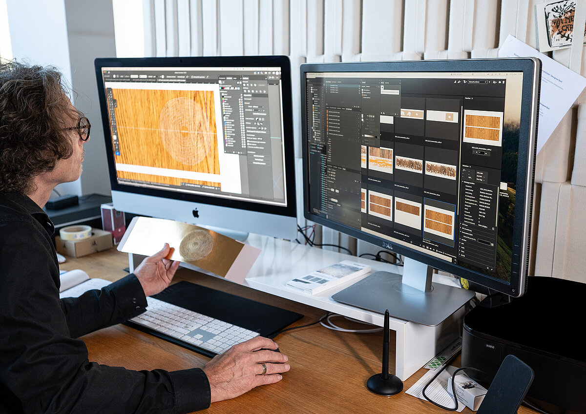
The answer lies in the interplay of multiple technologies. On the outside, SILVER LINE® Rain is applied using cold transfer and then overprinted in four colors, creating the distinctive wood effect. The inside is finished as well, combining KPS Slim cold transfer with four-color overprinting.
An additional blind embossing makes the fine wood grain not only visible, but tactile. The areas later used for laser-cut growth rings are deliberately left unembossed. This allows the printed image, embossing, and open areas to interlock with precision.
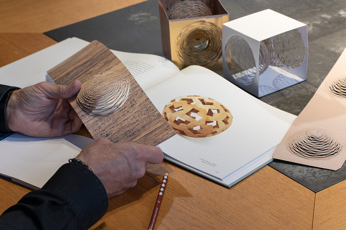
The laser provides the crucial next step. Delicate growth rings are cut out of the cardstock, while additional laser lines create scoring for the final shaping.
Then something remarkable happens. The flat card becomes a three-dimensional object. Precisely positioned scores and glued sections allow the card to stand upright. The open growth rings reveal the interior - translating Wurmer’s sculptural principle into an entirely different material.
Cardstock becomes space. A greeting card becomes a small work of art.
Even the personal year-end message becomes part of the design concept: LUXOR® 385 is used for the greeting text, enabling exceptionally fine double-sided hot stamping on 300 g/m² Magno Matt paper.
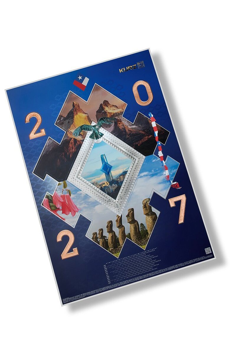
While our holiday card opens up spaces, the 2027 wall calendar sets out on a journey. Its destination: Chile.
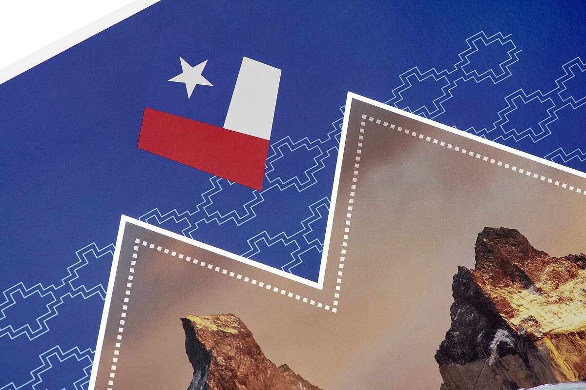
Few countries are shaped by contrasts quite like Chile. Snow covered mountain peaks, endless coastlines, fascinating wildlife, and cultural icons meet modern architecture and traditional patterns.
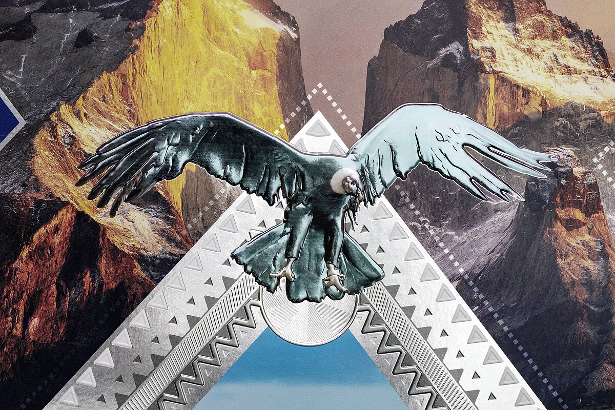
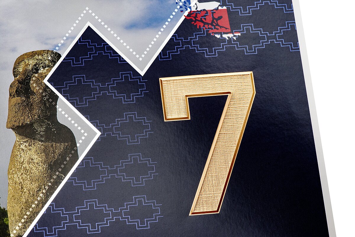
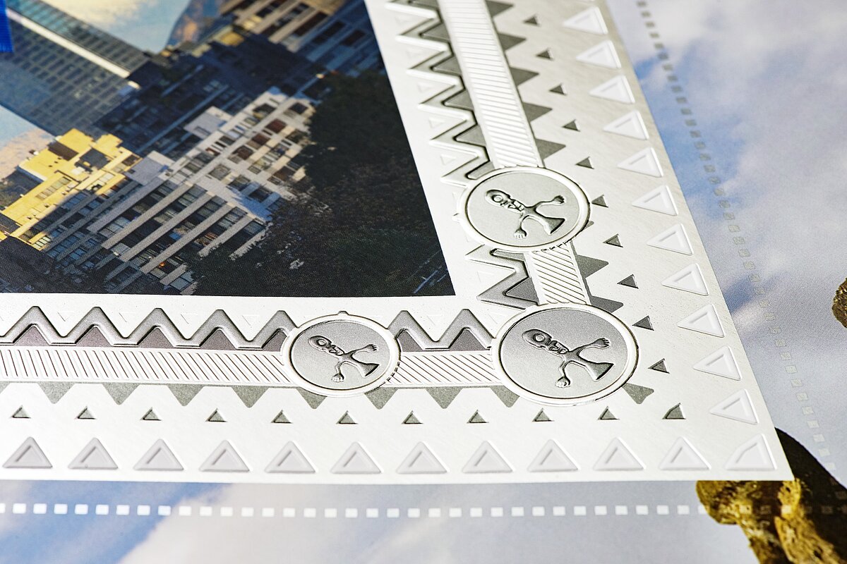
Capturing this diversity in a single design was the creative challenge behind the new calendar. Across the A1 sheet, we encounter the striking peaks of Torres del Paine National Park, the moai of Easter Island, the Andean condor, and the copihue, Chile’s national flower. Santiago’s Costanera Tower provides a modern counterpoint.
Here, too, the image alone does not tell the whole story. It is the interplay of different printing and finishing technologies that gives the design its brilliance, texture, and tactile appeal.
The foundation is a cold transfer using ALUFIN® Silver. The metallized surface is then overprinted in four colors, giving landscapes, geometric elements, and color gradients a distinctive luminosity. Depending on the viewing angle, the surface produces changing reflections and an extraordinary sense of depth.
At the center of the calendar is a large diamond shape - a stylized reference to lapis lazuli, Chile’s deep-blue national stone. LUMAFIN® Blue and fine micro embossing give it intense color and a textured surface.
The Andean condor gets its own moment as well: LUMAFIN® Clear adds transparent gloss accents without obscuring the image beneath. Relief embossing, meanwhile, gives the year 2027 and the KURZ logo a sculptural presence.
A blind embossing provides the finishing touch. The Andean condor and central diamond are rendered in multi-level embossing, creating an interplay of light, shadow, and relief.
The result is a design made not only to be seen. It invites you to touch it.
Wood grain and mountain landscapes. Laser cutting and micro embossing. Art from Fürth and inspiration from Chile. At first glance, our two year-end projects could hardly be more different.
And perhaps that is exactly what they have in common.
Both show what becomes possible when design goes beyond the visible surface. When material, technology, and concept are considered together from the very beginning. When metallic brilliance is deliberately combined with color, textures become not only visible but tactile, and a two-dimensional surface suddenly gains spatial depth.
The result is something that invites discovery - and perhaps encourages you to look just a moment longer.
With that in mind, we wish you a wonderful close to the year, a restful holiday season, and a brilliant start to 2027.
You're in the right place! Just drop us a message. How can we help?
 Subscribe to newsletter