A whale swims through a Piedmont vineyard. It almost seems to be having a conversation with the owner of the winery, until it finally dives down into the depths of the hillside – only to reappear on a wine bottle. A curious story? It’s a true story – in a way. Jana Kokrhanek, CEO of Luxoro, can tell us all about it. Learn more about Barolo Balena, and why it’s not just about a whale and a wine but mostly about design.
The Langhe in the northern Italian region of Piedmont is a landscape for connoisseurs. This is where the Slow Food movement began. The town of Alba and its famous white truffles are well known. And of course there’s Barolo, a small place with a big name. It was the inspiration for the wine that the people here make from the Nebbiolo grape variety, vintners like Michele Chiarlo and his sons. It’s a landscape where stories grow, like the one that Jana Kokrhanek told us.
Long before there were vineyards here, the entire region was covered by a sea. In one of these vineyards, the fossilized remains of a prehistoric whale were discovered in the autumn of 1993. It was precisely this discovery that triggered a collaboration that ultimately resulted in an extraordinary design project. At its heart: Barolo Balena, the whale in the vineyard. But see for yourself...
How do designers come up with an idea like that? What was it that drove Kokrhanek to collaborate with winemakers in the first place? And why Michele Chiarlo? To understand requires some background. Luxoro has been KURZ’s exclusive representative in Italy for over 50 years. The finishing and decoration of products, especially with gold embossing foils for wine labels, make up a substantial part of Luxoro’s business. It’s a very comfortable situation, but Kokrhanek often noticed that something wasn’t right when she looked at wine shelves. Many labels looked very similar, and they didn’t answer the question of why you should reach for this or that wine in particular. The more she thought about it, the more questions she had: Who’s responsible for “more attractive” labels: vintners, designers, or retailers? Who even defines the aesthetic factor? After all, isn't it just about the contents, in other words, the wine, and not about a piece of paper on the bottle? Or should you show everyone involved what’s possible with an extraordinary label? Shouldn’t you spark enthusiasm and motivation, build trust, and tell stories? It sounds like a lot of work – and who should be doing it?
It turned out to be even more work than imagined. But paradoxically, the solution emerged almost by itself – thanks to consistent market cultivation, good customer contacts, a lot of curiosity, many appointments, and what today is probably called a high-functioning CRM: good old-fashioned talking to each other. This developed into a fruitful dialog that, in turn, generated great new ideas.
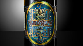
In addition, winemaker Alberto Chiarlo and Kokrhanek have known and appreciated each other for quite some time. Alberto’s father, Michele Chiarlo, is something of a living legend, and Alberto also enjoys pushing himself beyond the usual standards. At vinitaly, Europe’s most important wine exhibition, the two of them discussed a new collaboration with designer Mario di Paolo at Michele Chiarlo’s booth. Alberto Chiarlo mentioned the skeleton of the whale, and that immediately sparked di Paolo’s imagination. It must be said that di Paolo is probably the most frequently honored wine label designer in Italy, plus he’s a born rule-breaker. He doesn’t take a label literally; instead, he interprets it using the core of a story as the starting point for an entirely unique narrative. His idea was to use the label to breathe new life into the whale story, to allow the whale to swim through the vineyard and dive down under it again – a metaphor for the almost mythical relationship between the animal, the wine, and the people who make it, so to speak.
The project resulted in precisely what you might expect when exactly the right people come together. Namely, multiple award-winning labels that aren’t content with the usual shapes and materials, but instead set standards – for beauty, for inspiration, and for stories that people like to hear. This becomes fully apparent after you’ve uncorked your bottle of Barolo and enjoyed the first drop. When you trace the skeleton of the whale in the embossed paper with your fingers. When the brilliant gold of the label literally brings the movement of the whale’s mighty tail to life. And when you can literally feel the soil of the vineyard in the paper’s rough texture and the color of the ink. It’s a pleasure through and through, provided that the contents of the bottle keep every promise made on the extraordinary label. This is undoubtedly the case with Barolo Balena.
Do you have questions relating to our article Barolo Balena: The whale in the vineyard ? Please contact Elke Andersch, through our user-friendly email interface
You're in the right place! Just drop us a message. How can we help?